Monday, July 26, 2010

Rebecca Ann Hobbs

Rebecca's work was pretty cool I thought. The art works I really liked were mostly from her series Up With the Fall, Down on the Diagonal. My favorites were Slip n' Slide, 2006 and Waiting, 2007. I also really like Drunk Power Poles.


Although I didn't particularily like Hobbs's work Ah-Round, I did find it quite interesting. She talked about Imperialism, and the colonizing of countries. This I am not to surprised about, as she is from Australia, a country that was heavily colonized and subject to imperialism. In the work Ah-Round The camera circles a black man watering his plants quite happily. In the hand out Hobbs gave us she says that the "360 degree camera movement represents moving full circle, and pays tribute to Marcus Garvey's BSL ambitions."


While viewing the video I thought of the colonization of Australia. The camera circumnavigates the island and Madou, the subject, who represents the indigenous people of Australia. He is happy, and is completely unaware of being viewed. It could be as if this is all about to get taken away from him. However the relationship the camera has with Madou is one of intimacy, not something a colonist would feel. I don't know if I am supposed to find these sorts of similarity's in the video, but it definitely ties in with the idea of Imperialism.


I think Hobbs has quite a lot of social knowledge. She has studied in California, now lives in New Zealand, and was brought up in Australia. Imperialism and colonization is not a foreign concept for these three country's, especially Australia.


While Studying in California Hobbs was surrounded by a lot of western themed things. So she made western themed artwork. Her other video piece is called Tumbleweeds, 2004. It features people slowly rolling/tumbling through an old western town. This piece deals more with the absurd than Imperialism, however when I think of Westerns or western movies or anything western I also think of Indians, A group of people heavily subject to a lot of colonization and imperialism.


I think Alex Monteith should win the Walters award, to be honest I was a little underwhelmed with all the contestants and there wasn't an artwork that I really liked. I base my decision on how aesthetically pleasing the works are, Monteith's motorcycles were the only work that I enjoyed looking at.

Thursday, July 22, 2010

Mary Curtis

Explore the relationships between function and decoration in the works of Mary Curtis with relation to her work processes and presentation in the exhibition.


Mary Curtis's exhibition at Objectspace in Ponsonby was quite interesting I thought. I really have no experience in jewelry making or wearing for that matter so I feel I have a bit of an outsiders view. The pieces were small and interesting, ranging from necklaces to brooches. They used a very wide variety of materials and really projected an invitation to touch. She used so many different types of materials, it seemed that most of them were very untraditional/contemporary. The piece I liked the most was defiantly the Green Blanket Necklace. This utilized different sections of a green tartan type blanket. With these pieces she is taking functional everyday objects and turning them into something decorative. Their purpose is completely turned around.


One thing I thought was funny is that she paralleled this technique with how the objects were displayed. Curtis used big glass cabinets to display individual pieces. Like the materials that the pieces use, the cabinets had their full functions revoked, which is a little sad I thought. The Jewelry was put on small spindly pedestals in these cases. The cases themselves were quite old and dull, almost antique looking. This contrasted greatly with the small contemporary jewels. There was almost something funny about peering into this massive dull old cabinet to look at a very small bright and pretty brooch or ring ect.


Curtis said she spent a lot of time in Europe and that this exhibit was a "Direct result of playing in Germany and following my travels around Europe". Whilst in Europe she spent time with fellow jeweler Helen Britton. The inspiration in the two artists work is very clear. It takes a little while but in Britton's work you start to recognize everyday items, you get the same sensation while looking at Curtis's pieces. The above picture is a Britton piece. I really feel the need to touch, just like I did at Objectspace.


Curtis I think is very aware of the function of objects, and how she can manipulate this to create her art. While talking to us she said, "She always considers the back of the object as importantly as the front." This says to me she is also very aware of how important presentation is to the object. Not only does this object have to improve and decorate a person, it has to stand on its own and be a work of art. Curtis has definitely achieved this, and all though I’m not exactly sure how the massive cabinets were supposed to make me feel, I do feel that they displayed the jewelry well. Maybe the focus was more on not taking away from the jewels rather then adding to them.


Just a note.. “Big glass cabinets” are called Vitrines. Must have missed that on the handout.

Thursday, May 20, 2010

Advertisement and me


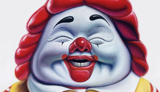
The type of advertising i find most successful is fast food advertising, I'm a bit of a fast food addict, and find it quite difficult to resist a burger. I like to put this down to the good advertisements these places have. I havn't personally seen the image at the top, but i think it is a good example of a successful add.

I think that these sorts of adds have become such a part of our lives people just tend to become unaware of them. Mcdonalds is everywhere, you just simply can't escape it. It infiltrates your city, your home, your work, your bus, your computer, your everything. The snippet we watched from the film They Live by John Carpenter relates to this concept very well.

I feel like that all the time (minus the glasses). Everything in the city is telling you something or wants something from you. I must have a whole barrage of filters up to prevent my mind from overloading (I get this burning mental image of the guy who put up yellow paper/plastic all over the adds in the city when i think of this, too bad i can't remember his name). I like to think in the movie my filters are his glasses, and this makes me think is that really a good way of advertising? If i'm abel to filter out such things, would less adds be more? would i notice them more if they were harder to see and not so in your face?

One thing that draws me to this add is how good the burgers actually look. No burger looks that good when you receive it, but even if you aren't hungry most people won't find it hard to crave a burger when they see one so made up. Another technique used by Mcdonald's here is their logo, sitting on top of an intense red background the bright golden arches seem inviting and quite happy. People who eat this food will start to associate this image with the good feeling of chowing down on one of these burgers.

The good thing about this day and age is that people are striving to be aware of all the little tricks that are being played on them. So most of us already know about Mcdonalds, add campaigns, and how companies are quite deceptive to get you to have and then want their product.

People who are aware of this quite like to make images and comment about it. Taking an original promo image and changing it to tell a different (most often opposite or truthful) statement is popular for young designers and artists, here is just a gaggle of images iv'e found on google. In return to these sorts of images I think Macas has wizened up, and is probably a little bit sick of being taken the piss out of. The link below is to a website that has a few new and creative adds by Mcdonalds. I actually quite like some of these images and think they are really clever, I also think it will be a lot harder for haters to manipulate these images to put Mcdonalds down.

I don't want it to sound like I am for or against fast food here, I just think it is interesting how add campaigns can change depending on the publics perspective of that company.

http://www.inewidea.com/2010/01/11/17764.html


Wednesday, May 12, 2010

Materiality, Surface, Affect, Site.


I really like Katsushika Hokusai's work The Great Wave of Kanagawa. As this work was done quite along time ago, and is from a different culture I had to do some research to fully understand it- wikipedia wasn't that helpful. Although it did say that most westeners would view it wrong-"the normal, traditional way to view the print would be from right to left, implying that Hokusai’s Great Wave was designed to tumble into the viewer’s face, so to speak”. This leads your eye down into the big wave and spits it out onto Mt Fuji, does this mean that Mt Fuji is the focus of the woodblock print? Probably, considering this piece is only one out of 36 in a series called Thirty-Six Views of Mount Fuji. Mt Fuji is pretty well worshiped in Japan and I'd say this print is quite popular because of that.

In the lecture you mentioned the style of Superflat and the artist Takashi Murakami. I did a little bit of work on him last year, and really like him. I love this style as it makes for very interesting paining. I looked at the two painting's above done by Murakami and tried to view them 'traditionally'. However this did not seem to work. Murakami's work is based around the culture of Otaku, witch is pretty much gaming culture in Japan. Murakami has colaborated with other brands and people like Louis Vuitton and Kanye West.

The way Murakami lays out his work is quite like Katsushika's Great Wave. When you said it is flat and has a minimal amount of depth I emidiatly thought of Takashi's works. It seems as if it is made of heaps of different layers and the image has just been flattened. I think though, with Murakami's paintings there is no one focus, it is the overall that the layers create that is the focus. This contrasts to the Great Wave, where it seems the goal is to portray Mt Fuji.

http://www.thefreelibrary.com/The+Great+Wave+off+Kanagawa-a0144047882 http://commons.wikimedia.org/wiki/The_Great_Wave_off_Kanagawa

Thursday, May 6, 2010

Narratives and Archetypes / Star Wars a New Hope

The Star Wars character I chose to write about Luke Skywalker. I chose him because he is the hero of the whole saga, this means he has to be attractive as a character and George Lucas definitely achieves this for me. Luke represents a lot of things for me, as a kid he was my hero. Now for me he sort of represents the kid at school who could never do anything wrong, ironically at school I was never that kid.

As a character I think Luke is pretty stereotypical, I would liken him to Neo off The Matrix, the Night Owl off the Watchmen and possibly Indianna Jones. All these characters share one vital thing in common and that is that they are all solidly good at heart. Obviously they all go through their different journeys and conflicts but ultimately arrive at the same destination due to their one defining characteristic. Maybe Luke wouldn't seem so stereotypical in 1977. The whole film is based around Luke and his journey. The ideas and themes you can draw from the film are a product of this journey.

Another character that I thought id talk about although not my favourite is Anikin Skywalker. I like the second trilogy and Anikin because they don't have a happy ending. This is quite a contrast in comparison to the first 3 films. The main characters also contrast against one another but in a parallel kind of way. I feel this sort of ending and themes is not common for sci-fi films, but may have started a trend. Avatar has the same sort of evil undertone and ending, I enjoy it.

I really liked this lecture, and like the idea of the dream world that never ends. As a kid i always had sci-fi dreams some of them were quite scary haha. I think that is why I like Sci-fi films so much, because you can just watch and escape. An extreme case in this age would be Avatar, I herd of people becoming seriously depressed after seeing the film. Because of how beautiful and dreamlike the world is in that film.

Thursday, April 29, 2010

Museums and Representation

The themed room in the Museum that i thought i would write about was the Scars on the Heart exhibition. It is part of the World War Two memorial section, and it had the biggest impact on me.

The exhibition had quite a lot of interactive things to do, and not everything was sectioned off.I found this interesting because as i walked through i was really not in a 'touching mood'. I felt quite sad, and was not in the mood for learning really. They were clearly trying to teach the general public about the war history. The Museum used lots of sound (heaps of things made noise), text (naturally there was plenty to read), and dim lighting, i think this was to promote the actual displays.

After this area i went to the World War Two Hall of Memories. This was a very sobering display. I texted my friend who had a grandfather in a prisoner of war camp, and then proceeded to find his name on the wall. I took a photo and then walked further down the hall, as it was just after Anzac day there were heaps of flowers and cards and stuff. The Hall was very successful in telling its story and I wouldn't have done anything to change the display, i thought it was very honourable and classy.

Robert Smithson's Museum of the Void raised some interesting thoughts for me. That piece of writing (link bellow) says that 'Museums are tombs, and it looks like everything is turning into a museum'.

I agreed with this statement to a degree. Everything in the museum was kind of fake and stale. I got very sick of looking at fake fish very quickly. By the end of walking around the museum my eyes were tired, so were my legs and also my brain. It was far too much information to take on at once, and soon i found myself avoiding things, and I felt bad in doing so.

I think this is quite interesting in that the case of most museums is that they are tombs. In fact if you go to a museum and don't expect to see dead things then your a little daft. Maybe what Smithson is trying to get at is that the commemorated dead often put a sobering tone over the whole museum. Maybe they should not be held in the same place.

http://www.robertsmithson.com/essays/void.htm


Thursday, April 22, 2010

Tongan Style

The Tongan Style exhibition at Fresh gallery was something that did not interest me much. I know very little about the Tongan culture and even less about embroidery and crochet. However I do apprieciate the level of skills it would take to make a sheet or dress with this sort of embroidery on it.

I understand the position I am in as a westener, I am forced to look into this culture and art from the outside. This makes me a little hesitant to make judgements about it and such. This type of gaze is different to the male gaze. I feel the male gaze is intrusive and judgemental, and in contrast the identity gaze is careful and curious.

These sheets and dresses put the Tongan culture into what I think would be quite a contemporary context compared to normal Tongan culture. These pieces of work are associated with traditional things such as religion and marriage but in this context they are seen as works of art.

I think it would take a lot of learning to fully appreciate and understand what these works of art a really about, the gallery staff who talked to us about them mentioned that the patterns were made up of symbols. This is just a little piece of insight.